Case study
Coastal Calm
Lighter Minds Psychology brand concept
- Type
- Self-initiated concept
- Studio role
- Brand, visual and UI direction
- Services
- Brand & web design
By Linda KisimisiLast updated
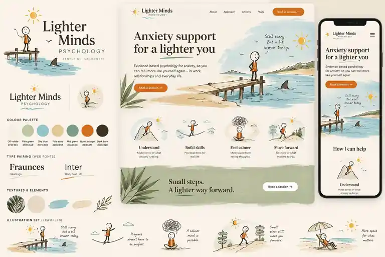
A speculative brand for an anxiety-support psychology practice that feels calmer, warmer and more human - without becoming childish or clinical.
Context
Coastal Calm is the working title for this case study; the speculative brand shown in the artwork is Lighter Minds Psychology. It is a self-initiated visual concept, not commissioned client work. The design question: how could an anxiety-support psychology brand feel calmer, warmer and more human without tipping into childish or clinical?
Design idea
A recurring hand-drawn character meets gentle moments of uncertainty. The shark-fin and pier visual is about facing something that still feels scary while taking a small step forward - "Still scary, but a bit braver today." Gentle humour targets the disproportionate anxious situation, never anxiety itself.
Visual system
An Australian coastal and wellness aesthetic: sun-bleached neutrals, paperbark greens, water blues, sand and tactile textures. Fraunces for headings, Inter for body and UI.
- Logo system
- Colour system
- Typography direction
- Character illustration system

Responsive experience
Landing-page UI direction explored across desktop and mobile, leading with "Anxiety support for a lighter you." and "Evidence-based psychology for anxiety, so you can feel more like yourself again", with a "Book a session →" entry point.
- Landing-page UI direction
- Responsive desktop and mobile visual exploration
- Booking call-to-action entry point
What we explored
- How warmth and calm can coexist with credibility
- Character-led storytelling that stays respectful
- A palette and type pairing that read as human, not medical
Next iteration
One reaction to the visual asked whether the recurring character would appear in the booking flow. That suggested the illustration was being read as part of the experience, not just decoration. The next design question is whether that character can become a light narrative thread through scheduling without distracting from a sensitive task. The booking flow has not been designed yet.
What this means for your business
- →A brand and website direction that makes a sensitive service feel warm and credible - useful when trust decides whether someone books
- →Booking entry points designed into the visual system from the start, ready to connect to WhatsApp and booking automation
- →A consistent look across web and messaging, so automated replies still sound and feel like your brand
What this build shows
- Brand concept development
- Illustration direction
- Tone of voice with sensitive subjects
- Responsive landing-page direction
Want a system like this?
Book a free systems audit. We look at how work flows in your business today and show you what is worth building first.